Artifi Webstore Configuration: This component is responsible for linking your Artifi configurations (It will be provided by Artifi’s team) to the B2B Webstore in Salesforce. On this configuration page, apart from Artifi’s configuration, you have to specify a customized price book as well as a default price for customization.
- Customized Price Book: This price book will carry the customization price for individual products. This price is shown to be used on PDP and will be added to the final price of the product as the cost for customization.
- Customized Product price: This provides a default price for customization. If there isn’t any pricebook entry for a customizable product, then this price will be taken as the cost for customization.
1. Open the Webstore record page, click on the gear icon at the top right corner, and click on “Edit page” to go to the edit page.

2. In the edit page, look for the Components section, in the components section, scroll down to access custom components under Custom - Managed. Drag the component Artifi Webstore Configuration to place it on the Webstore record detail page.

3. After placing this component, click Save in the top right corner and Activate it if needed.
4. Come back to Webstore’s record detail page on this page, you’ll see a New button on the component you just placed, click on it, fill in the configurations provided by the Artifi team, and save it.


5. Now that you set the Configurations, we are ready to place other components on the storefront.
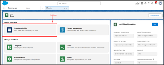
Open the Experience Builder to place other components .
To navigate to Experience Builder, click on the Experience Builder Tile on the webstore record detail page.
- Product Display Page: To Navigate to PDP click on the page section and type Product in the search there, you’ll see a Product page click on it.

On PDP, create two Sections in a Column inside the body to place the components. To do so, click on the column, and then a configuration pop-up will appear; in that pop-up, select a column layout with two sections.

- Artifi Initializer
- Artifi PDP Manager
- Artfi Product Name
- Artfi Product Price
- Artifi Custom Product Variants
- Artifi Quantity Selector
- Artifi Personalization Button
- Artifi Product Description
- Artifi Product Images
- Artifi Add Product To Cart
1. Artifi Initializer: This component is not visible to the user. It is responsible for loading Artifi's personalization script in the background. [Text Wrapping Break] Note: Please make to add this component to render other Artifi components.
1. To place this component, click on the thunderbolt icon to access all the components on PDP.

2. In the components, there is a Custom Component Section. In the custom component section, look for Artifi Initializer or simply type Artifi Initializer in the search bar under the component section.

3. Drag this component to column 2 .

After dragging it, you will see a configuration pop-up.
In configuration, if you want to let portal users know that there is some problem in Artifi Initialization, in that case, enable the Checkbox Show error to the user.
In Static Resource, we have a default selected Headless JS file. If a new version of the file is available, upload it to Static Resource and select it here. If a new version is not available, then the default selection will work fine.We provide one default script. If Artifi releases any future updates, you will be responsible for updating the script accordingly.
In Static Resource, select the Headless JS file that we uploaded in Static Resource.
2. Artifi PDP Manager: This component is not visible to users and is responsible for fetching all the product details and passing them to all other components on PDP. To place this component, click on the thunderbolt icon to open the components section and search for “Artifi PDP Manager” in it. Then drag and drop this component below. Artifi Initializer

After placing this component, you will see a configuration pop-up where Product ID Route is set for default, and another input is for Loading imag.e Enter the URL of the loader that you want to show on PDP

3. Artifi Product Name: Use this component to show the Product name to the user. Just like the other two components, search “Artifi Product Name” in the component section and place this component in column 2 about Artifi Initializer. This component comes with a lot of customizations in terms of styling which you can set in the configuration shown while placing this component.
3.1. Show product name and Label: Enable it if you want to show the name and SKU label before the product’s Name and SKU
3.2. Define Product Name Label: If you have enabled this “Show product name and Label” checkbox, you can set the label for Name from this field
3.3. Define Font Style For Product Name Label: Set the font style (normal, italics, etc.) for the Name Label
3.4. Define Font weight For Product Name Label: Set the weight of the font to define the boldness of the text
3.5. Define Font Size For Product Name Label: Set the font size for product name label
3.6. Define Font Family For Product Name Label: Set the font family of name label
3.7. Use Standard Text Style: Enable this checkbox to override all these configurations with the default one, which is set on Storefront’s theme.
3.8. Define Font Style For Product Name: Set the font style (normal, italics, etc.) for the Name Label
3.9. Define Font Weight For Product Name: Set the weight of the font to define the boldness of the text
3.10. Define Font Size For Product Name: Set the font size for product name label
3.11. Define Font Family For Product Name: Set the font family of the name.
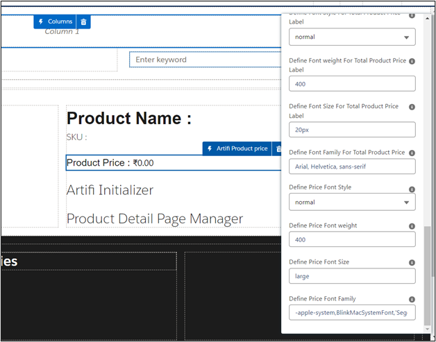
4. Arifi Product Price: This component shows the price of the component to the user. For personalizable products, it will show both actual and personalization costs which we set in the Artifi Configurations, for
non-personalizable products, it will not show personalize costs.
Drag this component under the Artifi Product Name
- Show Product Price Label:
- Show Product Customized Price Label
- Show Product Total Price Label
- Show Product Price
- Show Product Price
- Show Product Total Price
- Define Product Price Label
- Define Customized Price Label
- Define Total Price Label
- Product ID
- Use Standard Text Styling
- Define Font Style For Product Price Label
- Define Font weight For Product Price Label
- Define Font Size For Product Price Label
- Define Font Family For Product Price Label
- Define Font Style For Customized Product Price Label
- Define Font weight For Customized Product Price Label
- Define Font Size For Customized Product Price Label
- Define Font Family For Customized Product Price Label
- Define Font Style For Total Product Price Label
- Define Font weight For Total Product Price Label
- Define Font Size For Total Product Price Label
- Define Font Family For Total Product Price
- Define Price Font Style
- Define Price Font weight
5. Artifi Custom Product Variants: This component helps to select a product among its variations by showing the picklists for all the attributes that are set for the product in the CRM. Drag this component in column 2 under the Artifi Product Price
5.1. Color Label: Enter the Label of the color attribute that you have set in CRM (Label of the color field in Product Attribute Object). This is to show the color in Swatches

6. Artifi Product Image: This component shows the product Images Along with the carousel to switch between multiple images. In the carousel, thumbnails will be shown from both Artifi’s end and the Gallery image that we set in CRM on the product. If a product is personalizable, then by default Artif’s canvas will render, which the user can switch by clicking on any of the thumbnails below in the carousel. For the thumbnails from the Artifi side, a brush icon will appear on hovering over them
6.1. Image width (in px):
6.2. Image height (in px):
6.3. Size of image in carousel (in px):
6.4. The margin between the images in the carousel (in px):
6.5. Carousel width (in px)

7. Artifi Action Container: This component provides a Layout to place the Quantity Selector, Add to Cart button, and personalization button.
7.1. Component Direction: Defines whether to show components in horizontal and vertical directions.
7.2. Gap: defines the spacing between the components.

8. Artifi Quantity Selector: This component sets the quantity of product to add to the cart. Additionally, this component respects the quantity rules you have set for any product. Drag the Artifi Quantity Selector inside the Artifi Action Container that you just placed and drop it over the quantity Selector
8.1. Show Price Rule Description:
8.2. Show Quantity Label:
8.3. Define Quantity Controller Label:
8.4. Define Font Style For Quantity Controller Label:
8.5. Define Font weight For Quantity Controller Label: :
8.6. Define Font Size For Quantity Controller Label:
8.7. Define Font Family For Quantity Controller Label:

9. Artifi Add Product To Cart: This lets you add a product to the cart. For every personalized product, a new Cart Item is created for every new design, and for non-personalized products, it will add on the quantity in the existing cart item, if any.
9.1. Label for add to cart button
9.2. Label for add to cart button after the product is added to the cart
9.3. Error Message
9.4. Border Radius
9.5. background for button
9.6. Show Pop-up message on Add to Cart
9.7. Use colors from the theme

10. Artifi Personalization Button: Depending on the personalization type you have set on Product this button is shown to the user if the personalization type is Iframe, then only this button is shown to the user. This button will take the user to another page on which we have placed the Artifi IFrame component .
10.1. Personalize page name: Name of the custom page that we created for I-frame-based personalization
10.2. personalize button label
10.3. Personalize Button Button Background Color
10.4. Personalize Button Color
10.5. Personalize Button Border Color
10.6. Personalize Button Border Radius
10.7. Personalize Button Border Style
11. Artifi Widgets: This component contains all the Widgets provided by Artifi for personalization. Drag this component above the Artifi Initializer.

12. Artifi Product Description: Show the description of the product to the user. Drag this component and place it above the Artifi Initializer.
12.1. Show Product Description Label
12.2. Define Product Description Label
12.3. Define Font Style For Product Description Label
12.4. Define Font weight For Product Description Label
12.5. Define Font Size For Product Description Label
12.6. Define Font Family For Product Description Label
12.7. Use Standard Text Style
12.8. Define Font Style
12.9. Define Font font-weight
12.10. Define Font Size
12.11. Define Font Family

13. Artifi View My Cart Button on Pop-Up: This component shows a pop-up after a product is added to the cart, giving the user the option to navigate to the Cart or to stay on the page this Popup is dismissable.
13.1. Select continue shopping redirection option
13.2. Success Message After the Product Added
13.3. Success Message After the Product updated
13.4. View My Cart Button Label
13.5. Checkout Button Label
13.6. Continue Shopping
13.7. View My Cart Button Background Color
13.8. Checkout Button Background Color
13.9. Continue Shopping Button Background
13.10. View My Cart Button Color
13.11. Checkout Button Color
13.12. Continue Shopping Button Color
13.13. View My Cart Button Border Radius
13.14. Checkout Button Border Radius
13.15. Continue Shopping Button Border Radius
13.16. View My Cart Button Border Color
13.17. Checkout Button Border Color
13.18. Continue Shopping Button Border Color
13.19. View My Cart Button Border Style
13.20. Checkout Button Border Style
13.21. Continue Shopping Button Border Style
13.22. Define Font Style For Product Name
13.23. Define Font weight For Product Name
13.24. Define Font Size For Product Name
13.25. Define Font Family For Product Name
13.26. Define the label of the Attribute
13.27. Commerce header tag name

14. Artifi I Frame: To place this component, we need to create a new Custom page first to place this component on
14.1. To create a new page click on the Page Selection section in the top left corner

14.2. Then click on Standard

14.3. Then it will ask to name type “personalize” in both name and URL input and hit Create

14.4. After creating this new page to open this page click on the page Selection tab at the top left corner. Search Personalize and click Personalize page
 14.5. On the Personalize page, click on the thunderbolt icon at left to access the components. After clicking on this Icon in the search type Aritfi I frame, drag this component and drop it on column-1.

14.6. After placing this component again, click on the thunderbolt icon and search for “Artifi View My Cart Button” and drag this component above the Artifi I Frame component that we just placed.

Cart Page: Just PDP there are some components that need to be placed on the cart page. To handle personalized products that are added to the cart. To navigate to the cart page, click on the page tab at the top left corner, Search Cart, and click on Cart, which will then take you to the cart page.

Now that you are on the cart page, remove all the standard components that are already placed on the cart page
- Artifi Cart Items
- Artifi Cart Summary
-Artifi Cart Items: This component will display all the products that you have added to the cart, and this component will provide the functionality to update and view the design of personalized products. Update the number of products to be purchased along with the deletion of any particular cart item.
Click on the thunderbolt icon at left and search for Artifi Cart Items then drag this component and place it over Column1

This component provides you with a bunch of properties to customize as per your need
- Cart ID:
- Use Standard Text Style
- Define Font Style For Product Name
- Define Font Weight For Product Name
- Define Font Size For Product Name
- Define Font Family For Product Name
- Define Font Size For Product Name
- Define Font Family For Product Name
- Define Font Color For Product Name
- Define Empty Cart Message
- Define Font Style For Empty Cart Message
- Define Font Weight For Empty Cart Message
- Define Font Size For Empty Cart Message
- Define Font Family For Empty Cart Message
- Define Font Color For Empty Cart Message
- Define Continue Shopping Label
- Define the Background Color of the Continue Shopping button
- Define the Color of the Continue Shopping Button
- Define Empty Cart Image
- Loader Image URL
- Define Clear Cart Button Label
- Define the page size of the cart
- Show Price Rule Description
- Define SKU Label
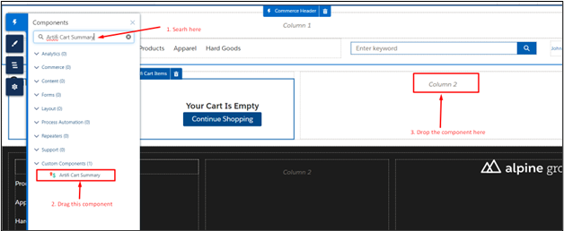
-Artifi Cart Summary: Again, click on the thunderbolt icon, search for Artifi Cart Summary, and drag this component to place in column 2
After placing this component a pop-up will show with some properties to customize this component as per your need
- Cart Id Data Binding use “{!Cart.Id}”
- show tax amount
- show the subtotal amount of the cart
- show the grand total amount
- show shipping amount
- Loader Image URL
Order Summary Detail Page: Just like another page, there is a component that needs to be placed on the Order Summary Detail Page.
To navigate to this page, click on the page tab at the top left corne,r then in the search bar, Search for Order Summary Details

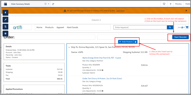
On the Order detail summary page, remove the Order Product and Reorder button, which are standard components.
To remove these component,s click on the order product component, and a trash icon will appear next to the component name. Do the same with the Reorder button.
Arifi Order Products: This component provides a better view over a personalized product that the user has ordered and gives them the option to reorder each individual product separately.
To Place this component, click on the thunderbolt icon and search for Artifi Order Product and place it in the place of the standard order Product component that you just removed.

Commerce Header: In the standard commerce header already placed at the top, remove the standard Cart Badge placed at the top right corner. To remove this, click on this cart badge then a trash icon will appear next to its name. Click on it to remove the icon.
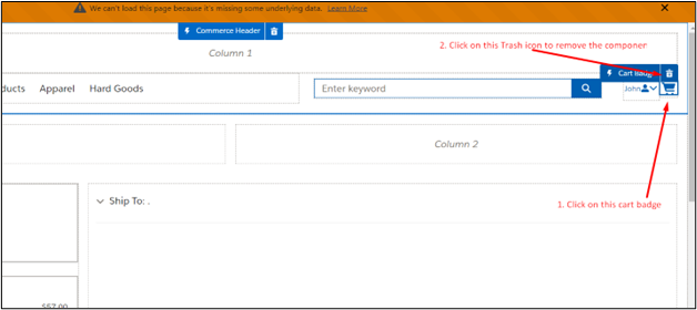
After removing the component, click on the Thunderbolt icon at the left and search for Artifi Cart Badge
Drag this component to the place of the standard cart badge.

Sample images:[Text Wrapping Break]You can choose any image for Loader and Empty Cart Image, or try using some sample images (Note: you need to add the URL of the sample images in the trusted site).[Text Wrapping Break]Loader Image:
https://integrationadmin.artifi.net/Content/Images/loadingImg.gif
Empty cart image:
https://artifi-dev-ed.develop.my.site.com/cms/delivery/media/MCNQB6OYTRGJDIBAWZCDZF27LRMU