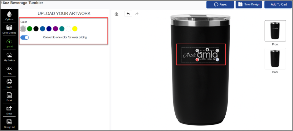
These components are currently active in base layout. Their container <div> elements are uncommented and will be mounted automatically by Artifi.initialize().
1.1 artifi-editor
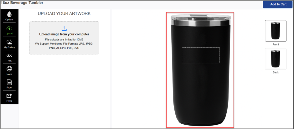
Description: Editor includes the product image area along with the canvas area (decoration area) on the product image. Editor component is mandatory to include in all the mentioned components below for rendering the other components.
The primary interactive canvas editor. Users add, select, move, resize, and style text and image widgets on this canvas. This is the core rendering surface of the designer
<div id="artifi-editor"></div>
1.2 artifi-360-editor
Description: Renders an embedded 360° interactive 3D product editor. Users can rotate a 3D product model and place or edit design widgets directly on the 3D surface. Supports zoom, rotation, and widget movement.
<div id="artifi-360-editor"></div>
1.3 Artifi-product-views
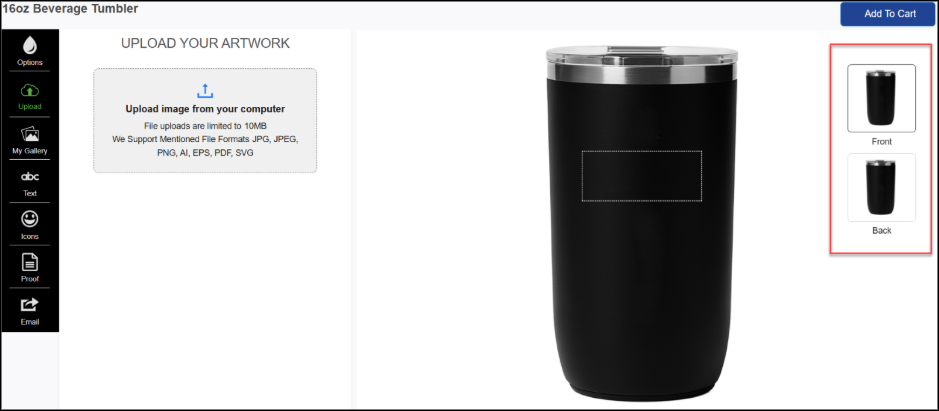
Description: Renders the product view thumbnail list (e.g., Front, Back, Left Side). Users click on a thumbnail to switch the active design view on the canvas. Supports horizontal and vertical carousel layouts.
<div id="artifi-product-views"></div>
Event Details
Event: "artifi-view-changed"
Description: This event is triggered when the view in the Artifi application is changed.
Event Handler:
window.addEventListener("artifi-view-changed", function (e) {
//Your code will go here
});
For more details about the event, refer to the documentation here: Artifi event details
1.4 artifi-add-to-cart
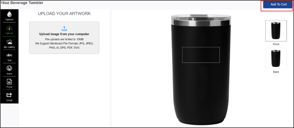
Description: The Add to Cart component will save the personalization data on the Artifi server and will return the unique order id that can be saved on the Ecommerce system. Renders the Add-to-Cart button. Two instances exist in the HTML — one for mobile layouts and one for desktop. The window.onload handler automatically removes the instance that does not match the user's device type, so only one button is active at runtime.
<!-- Mobile Layout-->
<div id="artifi-add-to-cart" data-art-container="mobile-display"></div>
<!-- Desktop Layout-->
<div id="artifi-add-to-cart" data-art-container="desktop-display"></div>
Event Details
Event: "artifi-add-to-cart-initialize"
Description: This event is triggered when the "Add to Cart" process is initialized in the Artifi application.
Event Handler:
window.addEventListener("artifi-add-to-cart-initialize", function (e) {
//Your code will go here
});
Event: "artifi-add-to-cart-success"
Description: This event is triggered when the "Add to Cart" process is successfully completed in the Artifi application.
Event Handler:
window.addEventListener("artifi-add-to-cart-success", function (e) {
//Your code will go here
});
Event: "artifi-add-to-cart-success"
Description: This event is triggered when the "Add to Cart" process is successfully completed in the Artifi application.
Event Handler:
window.addEventListener("artifi-add-to-cart-success", function (e) {
//Your code will go here
});
For more details about the event, refer to the documentation here: Artifi event details
Important: Do not remove the data-art-container attribute. The startup script depends on which instance to remove (Mobile/Desktop).
1.5 artifi-decoration-method
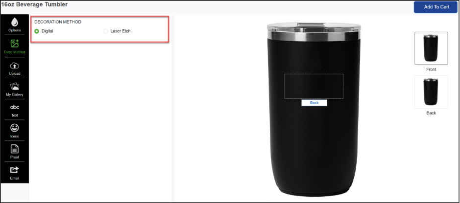
Description: Renders a decoration method selector (e.g., Embroidery, Screen Print, DTG). Allows users to choose how their design will be produced. Can optionally show a confirmation prompt before switching and reset design data on method change.
<div id="artifi-decoration-method"></div>
1.6 artifi-add-text
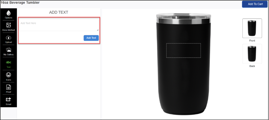
Description: Renders an "Add Text" button that creates a new editable text widget on the canvas when clicked. Used when the product allows free-form text placement
<div id="artifi-add-text"></div>
1.7 artifi-text-area
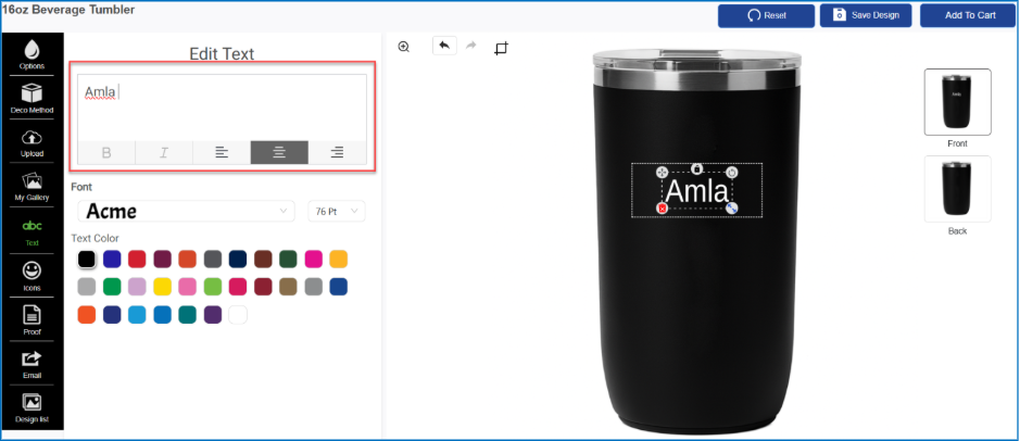
Description: Renders a text input control for editing the content of a text widget on the canvas. Can be scoped to a specific widget ID and product view, or follow the currently selected widget.
<!-- Follows currently selected widget -->
<div id="artifi-text-area"></div>
<!-- Scoped to a specific widget and view -->
<div id="artifi-text-area" data-text-id="text_1" data-view-code="front"></div>
1.8 artifi-text-family
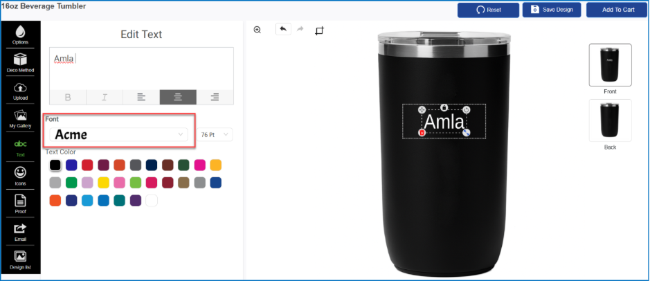
Description: Renders a font family selector for the selected text widget. Displays the allowed fonts as a dropdown or swatch grid as defined by the text widget's rules in Artifi Admin.
<div id="artifi-text-family"></div>
1.9 artifi-text-color
Description: Renders a color swatch panel for changing the text color of a text widget. Supports both preset color swatches and a custom color picker.
<div id="artifi-text-color" data-text-id="text_1"></div>
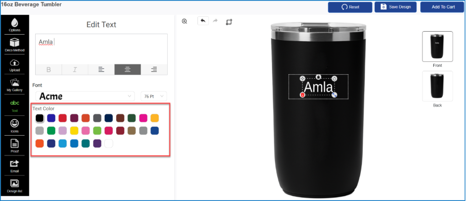
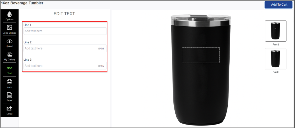
1.10 artifi-text-widget-list
Description: Renders a list of text widgets associated with the product design. Users can click a text entry in the list to select and edit that widget on the canvas. While editing text boxes will show the properties like textbox captions, bold, italics, horizontal alignment, number of textline, character limit for all lines, text validations (all caps, all small, auto uppercase, auto lowercase and only numbers), font size, auto font size, fonts family, and text color, only for the selected textbox. The text properties may vary depending on the rule properties enabled or disabled from Artifi admin.
<div id="artifi-text-widget-list"></div>
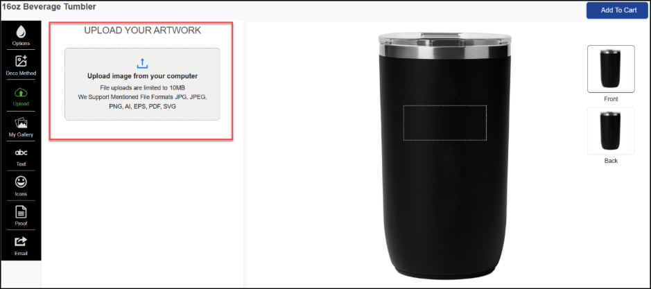
1.11 artifi-upload-user-image
Description: Using this component, the user can upload an image from their computer location to personalize the product.
<div id="artifi-upload-user-image"></div>
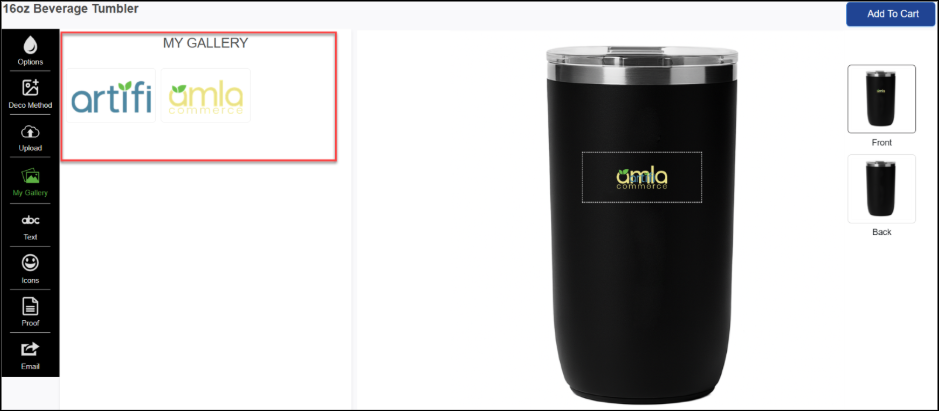
1.12 artifi-user-images (My Art / Display User Images)
Description: User Image component renders a gallery of previously uploaded user images (the "My Art" library).
<div
id="artifi-user-images"
data-image-id=""
data-view-code=""
data-add-widget="">
<div id="artifi-design-updated"></div>
</div>
1.13 artifi-product-attribute
Description: Renders a product attribute selector (e.g., color variants, material options) as swatches, cards, or a dropdown. These attributes are used to show the variants so that the user can change the variants. The attributes and variants are set up in Artifi admin.
<div id="artifi-product-attribute" data-attr-style="circle"></div>
Event Details
Event: "artifi-sku-changed"
Description: This event is triggered when the SKU of a product in the Artifi application is changed.
Event Handler:
window.addEventListener("artifi-sku-changed", function (e) {
//Your code will go here
});
For more details about the event, refer to the documentation here: Artifi event details
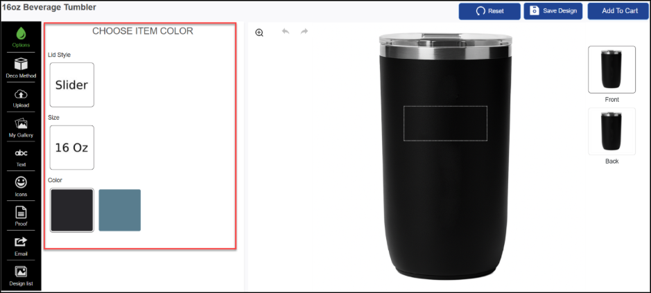
1.14 artifi-remove-background
Description: Renders a button that removes the background from the selected image widget on the canvas using AI-based background removal. Part of the Effects module.
<div id="artifi-remove-background"></div>
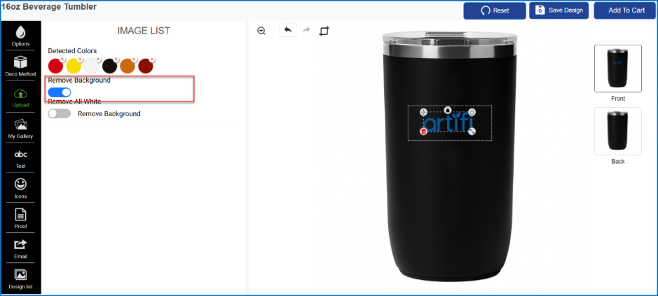
1.15 artifi-remove-all-white
Description: Renders a button that removes all white pixels from the selected image widget, making the white areas transparent. Useful for images with white backgrounds that need to be applied to colored products.
<div id="artifi-remove-all-white" ></div>
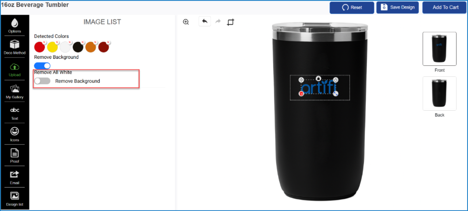
1.16 artifi-clipart
Description: Renders a clipart image gallery that allows users to browse and select pre-approved clipart images to place as widgets on the canvas. These cliparts are the cliparts added in Artifi admin. Below are the 2 ways on which the cliparts will be displayed using the following parameters.
1.16.1 Client Code - If the clipart family has a client code, the clipart will be displayed on the basis of client code.
1.16.2 Rule Code - If the clipart family does not have a client code, the clipart will be displayed on the basis of rule code.
Note - If both the parameters client code and rule code are passed, the priority will be given to the client code.
Refer the details of clipart API here
<div id="artifi-clipart"></div>
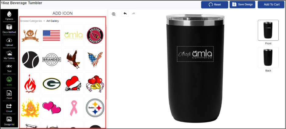
1.17 artifi-clipart-families
Description: Renders a hierarchical clipart browser organized by families/categories. Users can navigate category trees and browse clipart within each family. Supports dropdown and inline display modes. These clipart hierarchy will be defined in thein Artifi admin.
<div id="artifi-clipart-families"></div>
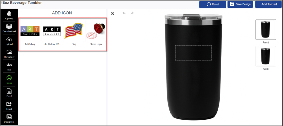
1.18 artifi-clipart-families
Description: Renders a gallery of pre-designed templates that users can apply to the canvas. Applying a template replaces the current design layout with the chosen template's layout and content.
<div id="artifi-template-list"></div>
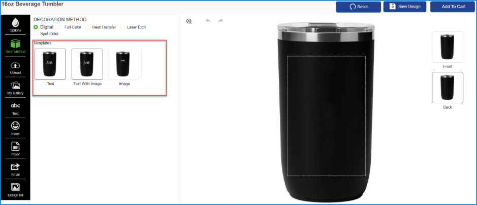
1.19 artifi-image-list
Description: Renders a list of pre-loaded product image widgets available for placement on the canvas. Used when the product design includes pre-defined image slots with an approved set of images.
<div id="artifi-image-list"></div>
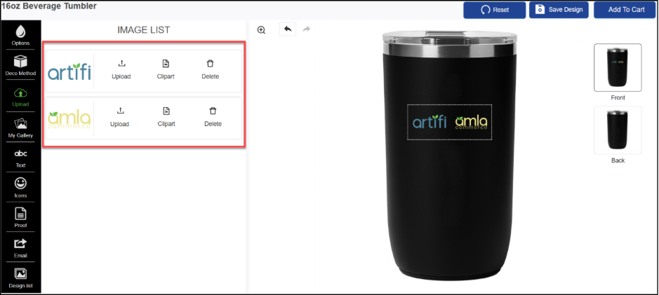
1.20 artifi-canvas-zoom
Description: Renders zoom-in and zoom-out control buttons for the editor canvas, allowing users to adjust the canvas view scale without affecting the design.
This is a configurable feature component that can be enabled from the Artifi Admin portal. To enable feature, follow the steps provided in the link.
<div id="artifi-canvas-zoom"></div>
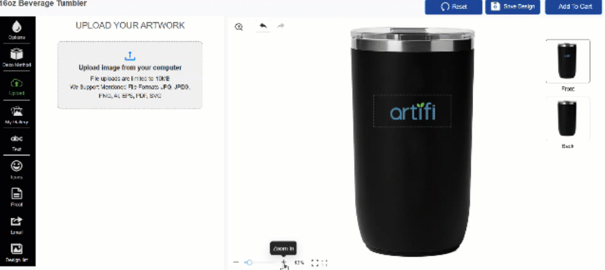 Note: This component has no configurable HTML parameters. Drop the <div id="artifi-canvas-zoom"> into the canvas zone to activate it
1.21 artifi-crop
Description: Provides image cropping controls for image widgets on the canvas. Supports free-form and aspect-ratio-locked cropping, with optional auto-crop on image placement.This is a configurable feature component that can be enabled from the Artifi Admin portal. To enable feature, follow the steps provided in the link.
<div id="artifi-crop"></div>
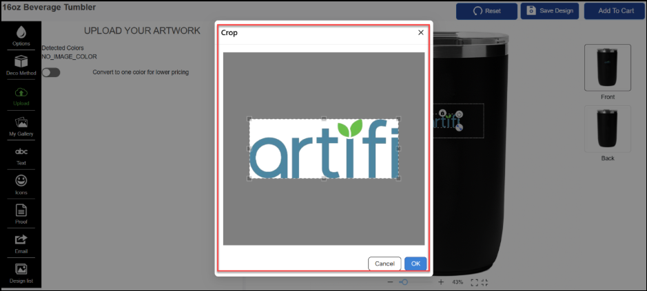
Note: The Crop icon is displayed only when an image widget is selected in the editor. Clicking the Crop icon opens a pop-up window where you can crop the image.
If Auto Crop is enabled, the crop pop-up will automatically appear immediately after
an image is uploaded.
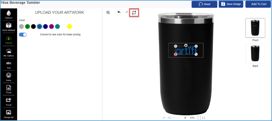
Crop enabled on selected image widget
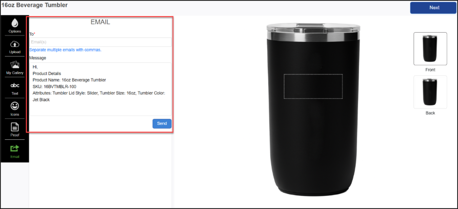
1.22 artifi-email
Description: Renders an email-sharing button that allows users to email the current design preview or a design link. Supports both popup modal and inline display modes.
This is a configurable feature component that can be enabled from the Artifi Admin portal. To enable feature, follow the steps provided in the link.
<div id="artifi-email"></div>
Event Details
Event: artifi-email-success
Description: This event is triggered when Email is sent successfully.
window.addEventListener("artifi-email-success", function (e) {
console.log("artifi-email-success", e.detail.data);
});
For more details about the event, refer to the documentation here: Artifi event details
1.23 artifi-toolbar
Description: Renders a floating widget toolbar that appears when a widget is selected. Provides visual controls for move, rotate, Flip, adjust position and scale operations.
This is a configurable feature component that can be enabled from the Artifi Admin portal. To enable feature, follow the steps provided in the link.
<div id="artifi-tool-bar"></div>
1.24 artifi-save-draft
Description: Save Draft button designed to save customized designs efficiently. This component enables users to save their in-progress customizations as a draft for future editing or completion. Users can also name their design and save it for future retrieval. This is a configurable feature component that can be enabled from the Artifi Admin portal. To enable feature, follow the steps provided in the link.
<div id="artifi-save-draft"></div>
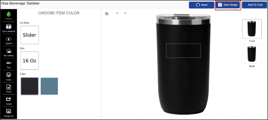
Save Design Action
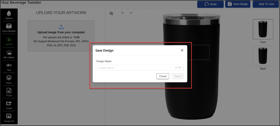
Enter Design Name
1.25 artifi-draft
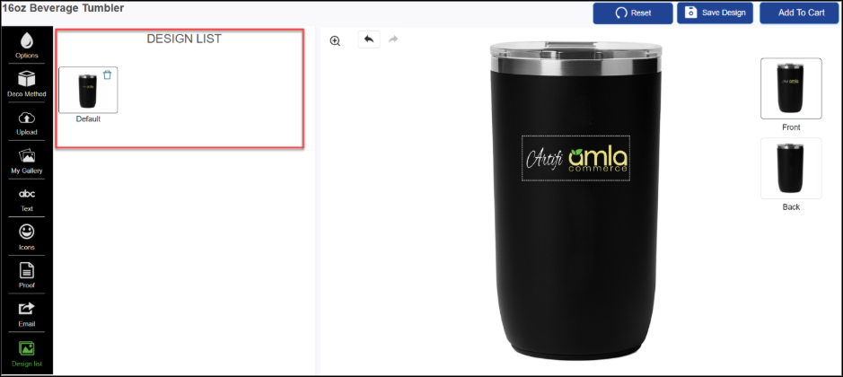
Description: This component displays a list of saved designs for the user. It allows users to preview previously saved designs and apply a selected design to the current designer session.
This is a configurable feature component that can be enabled from the Artifi Admin portal. To enable feature, follow the steps provided in the link.
<div id="artifi-draft"></div>
1.26 artifi-imprint-color
Description: This component includes a set of colors that can be used to colorize the image/logo and text within the editor. Allows users to choose colors permitted by the selected decoration method, with toggle switch support. This component will only be available when widget is selected and needs to manage the hide/show of component on PDP.
This is a configurable feature component that can be enabled from the Artifi Admin portal. To enable feature, follow the steps provided in the link.
<div id="artifi-imprint-color"></div>
<!-- With toggle switch disabled -->
<div id="artifi-imprint-color" data-toggle-switch="false"></div>